
Letter Formation: Why the "a" in Most Learning Apps Is the Wrong Shape
Almost every app shows children a two-storey "a", the one you are reading now. Almost no school teaches children to write it. Here is why that mismatch matters and what to look for instead.
The short version
- The "a" and "g" in most fonts are two-storey print forms that children are never taught to write, schools teach a single-storey round "a" and a looped "g".
- Stroke order and direction matter as much as the finished shape: letters are movements before they are pictures.
- Almost all English letters start at the top; the common exceptions are d, e and the up-first letters in some handwriting schemes.
- An app that draws letters in a text font is showing your child something they will have to unlearn.
Open almost any alphabet app and look carefully at the lowercase "a". You will almost certainly see this one: a, a curved bowl with a hook arching over the top. It is called a two-storey or double-storey "a", and it is what nearly every typeface uses.
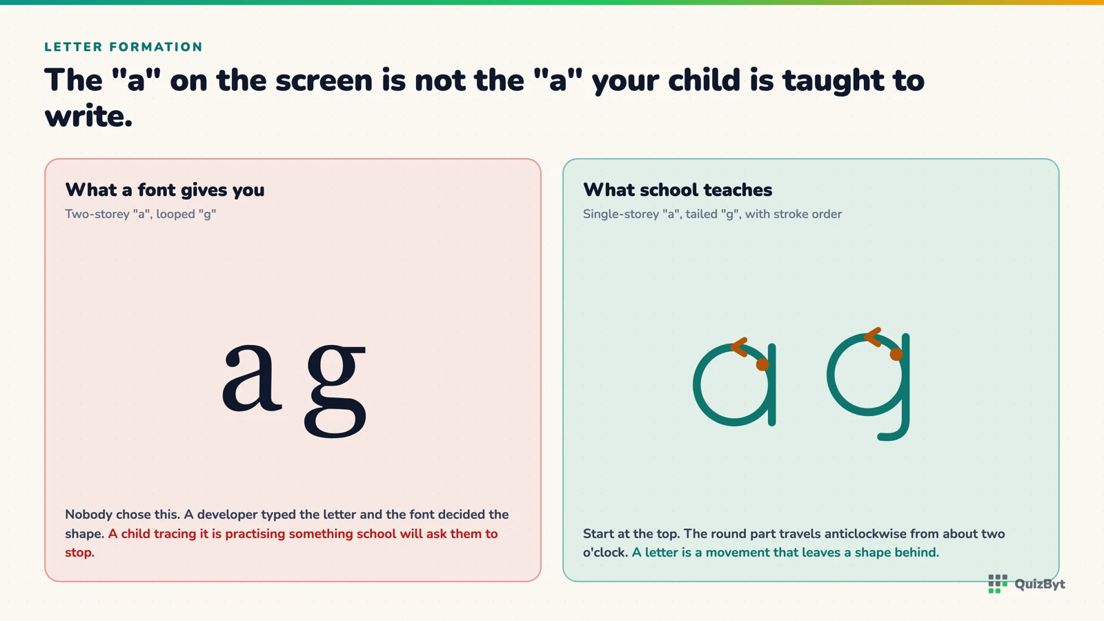
Now look at what your child is taught to write at school. It is this one: a plain circle with a single straight line down its right-hand side. One storey. No hook.
The same thing happens with "g". Books and screens show a two-storey "g" with a closed loop underneath. Schools teach a single-storey "g": a circle with a tail that hooks left.
Why the mismatch happens
Nobody chose this. It is an accident of how software is built. A developer writes the letter "a" into the page, the browser renders it in whatever font the app uses, and the font (designed for reading paragraphs, not for teaching handwriting) supplies the printing form. Nobody involved ever decided that a four-year-old should copy it.
For reading this is harmless; children cope with both forms early and need to, since every book they will ever open uses the printing one. For writing it is not harmless. A child tracing a two-storey "a" is practising a shape their teacher will then ask them to stop making.
Letters are movements, not pictures
The deeper issue is that a letter is not really a shape at all. It is a sequence of movements that happens to leave a shape behind.
This is not a stylistic opinion. Neuroscience research on pre-literate children has found that the physical production of letters activates reading circuitry in a way that passive viewing does not, brain imaging studies by Karin James and colleagues compared children who produced letter forms themselves against children who only observed them, and found different activation patterns. Related work by Longcamp, Zerbato-Poudou and Velay (2005) trained thirty-eight three- to five-year-olds to copy letters either by hand or by typing them. After three weeks, the older children in the handwriting group recognised letters better than those in the typing group.
The mechanism people propose is that handwriting gives continuous feedback about the shape being made, vision, motor command and the felt sense of the movement all arriving together and building an internal model of the letter. A shape you have only looked at has no motor trace attached to it.
Which means stroke order and direction are not pedantry. They are half of what is being learned.
The rules that actually matter
Standard manuscript handwriting, the scheme used in most English-medium schools, comes down to a few principles:
- Start at the top. Nearly every letter begins at its highest point. This single rule prevents most of the bad habits that are painful to fix later.
- Top to bottom, left to right. Vertical strokes go down, not up. Horizontal strokes go left to right.
- Circles go anticlockwise. The round part of a, c, d, g, o, q starts at about the two-o'clock position and travels left. A clockwise "o" looks identical and joins terribly.
- The exceptions are few. In most schemes d starts with its round part and e starts with the horizontal bar. Everything else starts at the top.
What we did about it
This problem is the reason the letters in the QuizByt tracing activity are not typed at all. Every letter is drawn from stored stroke data (a list of points describing the actual path a hand takes) rather than rendered in the app's font. The single-storey "a" and "g" a child traces on screen are the forms they are taught to write, the arrows show the direction each stroke travels, and the numbered order matches standard manuscript formation.
The same stroke data generates the printable worksheets, so the letter on paper is identical to the letter on screen. That sounds obvious. It is surprisingly rare, because generating a worksheet from a font is much less work.
What to check in any app
Three quick tests before you let a child trace anything:
- Is the lowercase a single-storey? Is the g?
- Does it show where each stroke starts and which way it goes, rather than an outline to fill in?
- Does it insist on stroke order, or will it accept a letter drawn backwards as long as the pixels end up in the right place?
An app that fails all three is a colouring book with letters on it. That is not worthless, but it is not teaching handwriting.
Worth reading next: what the brain research says about screen tracing versus a pencil, and how to use printable tracing sheets so they actually work.
Questions parents ask
What is a single-storey a?
The round "ɑ", a circle with one vertical stroke down the right side. It is the form nearly every school teaches for handwriting. The two-storey "a" with a hook on top is a printing form used in books and on screens.
Does it really matter which "a" my child sees?
For reading, no, children learn to recognise both. For writing, yes: a child copying a two-storey "a" is practising a shape their teacher will ask them to change.
Which letters do not start at the top?
In most standard manuscript schemes, d and e are the usual exceptions, d starts with the round part, e starts with the horizontal bar. Everything else begins at the top.
Why does stroke direction matter if the letter looks right?
Because handwriting has to become automatic. A letter drawn bottom-up looks fine on its own but breaks down at speed and when joining, and it is much harder to correct at seven than to learn at four.
Responses
Sign in to join the conversation. Responses are open to people with a QuizByt account, which is how we keep this a place you would let your child read.
Loading responses…
Lessons that talk, quizzes that mark themselves, games that make kids think
QuizByt is matched to your child's class. Classes 1–10 and Cambridge O Level. Every subject opens with a free lesson, quiz and worksheet, no account needed.
 Screen Tracing vs Pencil on Paper: What the Brain Research Actually ShowsA finger on glass and a pencil on paper are not the same activity. The research is clearer than most app marketing admits, and it points to using both, in a particular order.Read the article →
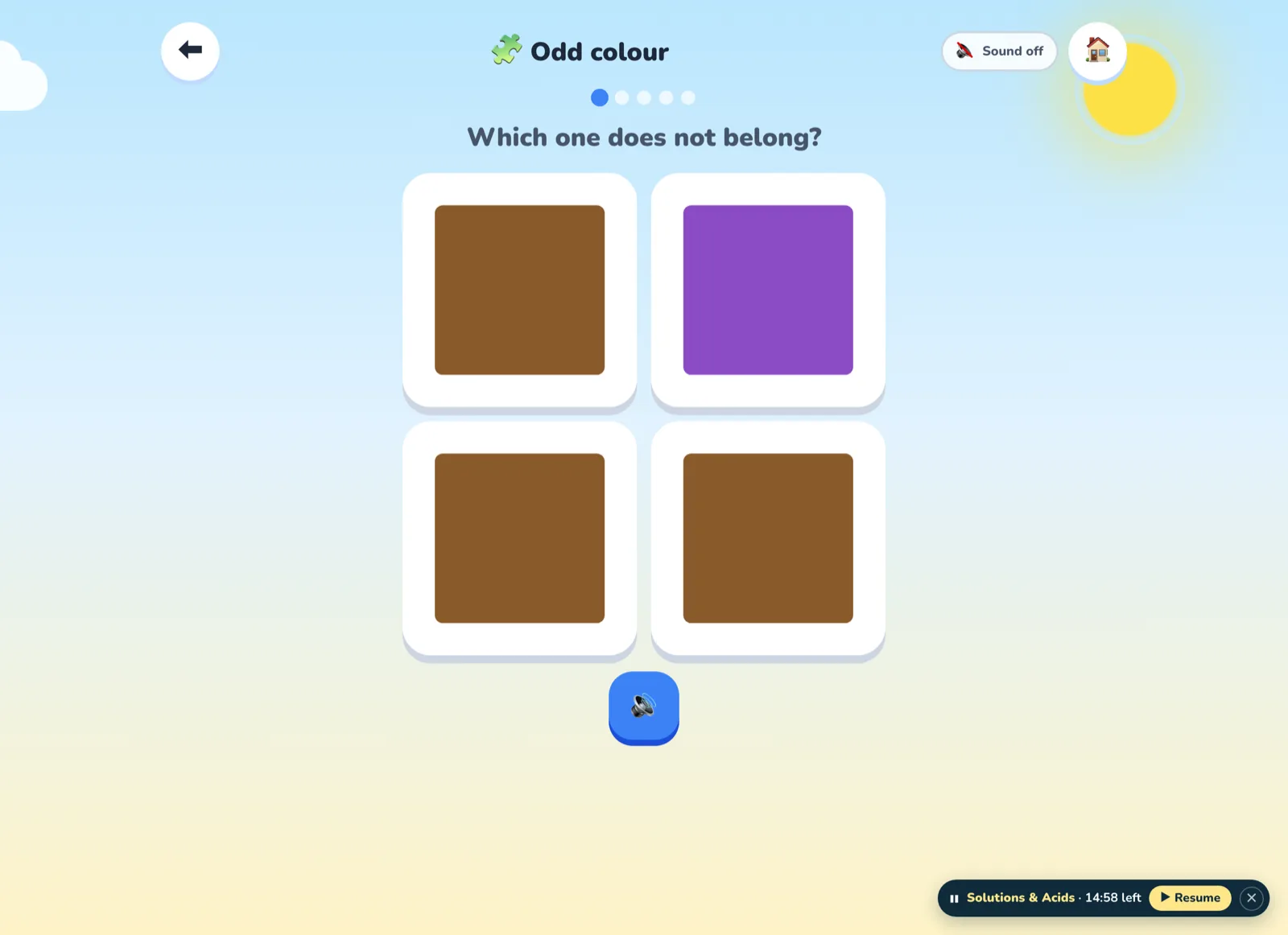 Odd One Out: The Two-Minute Game That Teaches a Three-Year-Old to ReasonFour pictures, one that does not belong. It looks like a puzzle, but it is the first piece of real logical thinking a small child can do, and the learning happens in the answer to "why?", not the tap.Read the article →
 Credits Decide Which Game Opens Next: The Unlock Ladder ExplainedOne credit opens the first game in each section. Eleven opens the second. Fifty-one opens everything. The exact numbers, where credits come from, and why the ladder is in that order.Read the article →